Našimi kurzy prošlo více než 10 000+ účastníků
2 392 ověřených referencí účastníků našich kurzů. Přesvědčte se sami
Creating of graphs and tables in Power BI is quite intuitive. Unless you set it differently, the default color style is used for everything, (and can be customized in each visual).
However, to make the whole visualization in our company colors would be too laborious – if you modify each chart individually.
In such a situation you can use custom color styles..
First, create a .json file (or download it from here):
Then you can define different colors in the HEX style for all elements.
{
“name”: “exceltowntheme”,
“dataColors”: [“#42f456”, “#e82c17”, “#777374”, “#777374”, “#D79A12”, “#bb7711”, “#114400”, “#aacc66”],
“background”:”#000033″,
“foreground”: “#ff0000”,
“tableAccent”: “#568410”
}
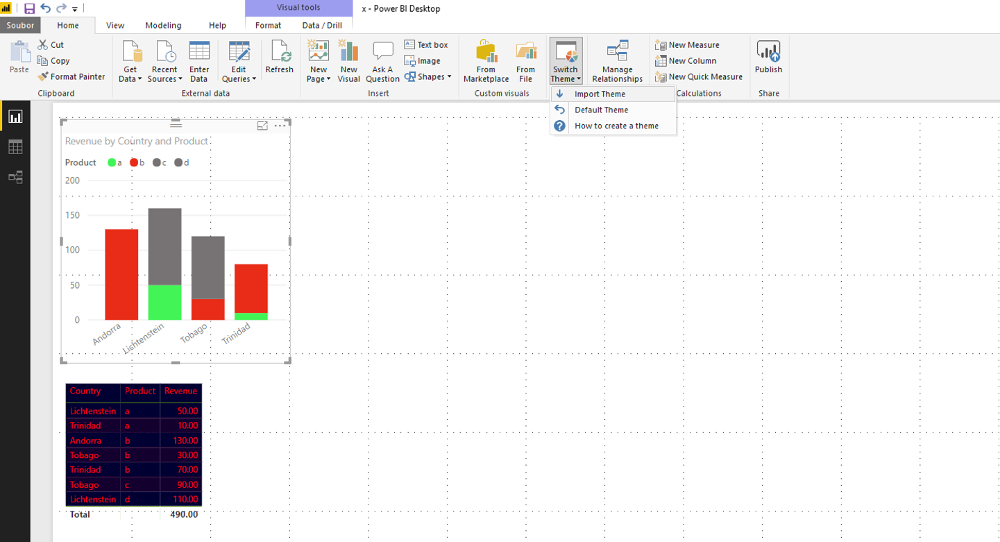
Now simply load the file, and from now all charts and tables in this pbix file are in your colors.
![]()
![]()
Pište kdykoliv. Odpovíme do 24h
![]()
© exceltown.com / 2006 - 2023 Vyrobilo studio bARTvisions s.r.o.