Našimi kurzy prošlo více než 10 000+ účastníků
2 392 ověřených referencí účastníků našich kurzů. Přesvědčte se sami
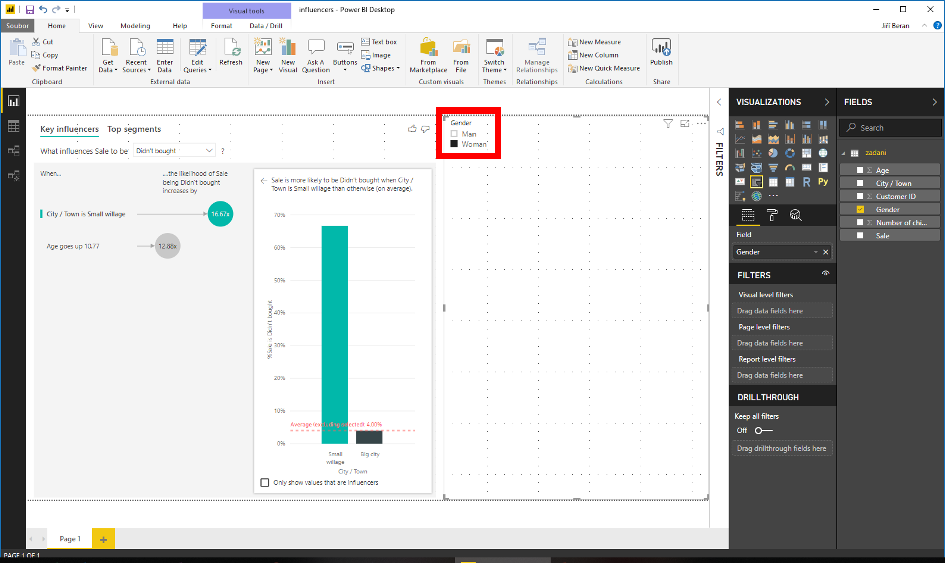
Key influencers is a visual that not only displays data, but also cleverly analyses it and searches for its interrelations – similarly as it does datamining add-in in Excel.
It operates in the following way: we take a dependent variable and search for an independent variable that explains it in the best way.
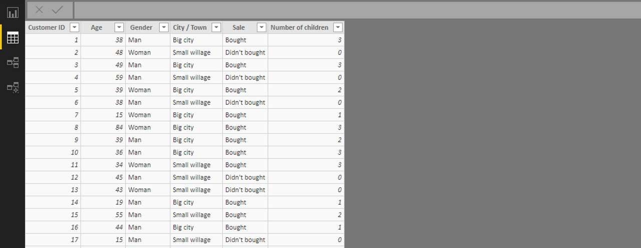
We use the following table where we search for groups of users that have the strongest tendency to buy certain products.
The visual itself is quite simple – the dependent variable goes to “Analyze” (the one that is assumed to be explained by other variables) and the independent variables go to “Explain by” (these variables might explain it).

The visual shows tightness of dependencies. We can click on each bubble and see the graph depicting each dependency in more detail.
This visual works certainly also with slicers or in combination with another graph – for example, the respective dependencies can be depicted as representing only women:
![]()
![]()
Pište kdykoliv. Odpovíme do 24h
![]()
© exceltown.com / 2006 - 2023 Vyrobilo studio bARTvisions s.r.o.