Našimi kurzy prošlo více než 10 000+ účastníků
2 392 ověřených referencí účastníků našich kurzů. Přesvědčte se sami
This article describes an interesting Power BI visual – Synoptic Panel.
Synoptic Panel works differently from other visuals, that are mostly based on predefined tables / charts / maps…
In Synoptic Panel you can draw the “map” of area (production line, store…) and use your data to highlight different areas differently – based on your numbers.
So if this was a map of store area, we can compare, how utilized were the three halls inside.
To make it work you have to take these steps.
Let´s do it.
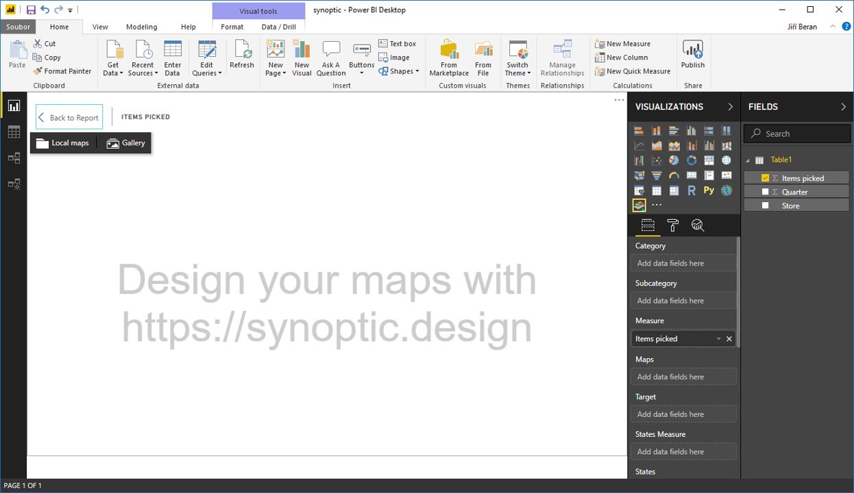
In any graphical editor create the map of area, and save it as .png, .jpg…
Upload the image on https://synoptic.design/.
![]()
Now we have two options. Either draw new shapes on the background, or use the already created and just name them.
Anyway, on the right side new areas appears – containing coordinates of their corners. It is crucial to have the same names for areas and in data tables. So, if it is “Store A” in Synoptic, it has to be “Store A” in tables.
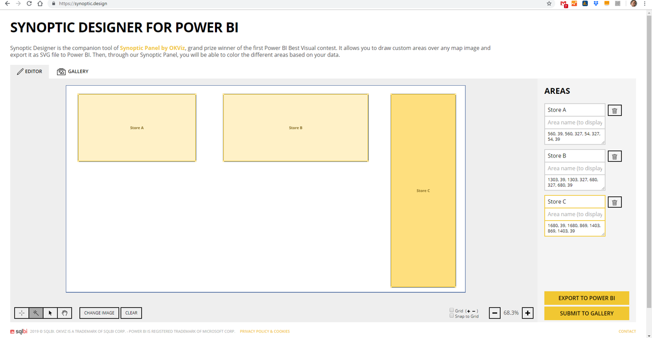
Click on Export to Power BI and download the file.
Open the Power BI. Add the Synoptic Design custom visual.
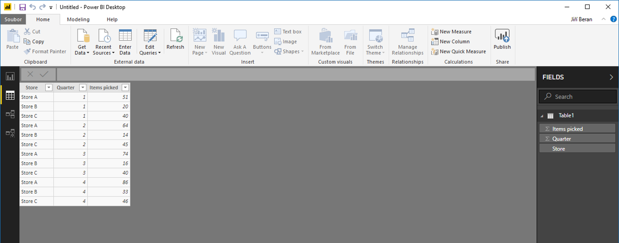
Connect data. In this case containing stores, quarters and numbers of stored items.
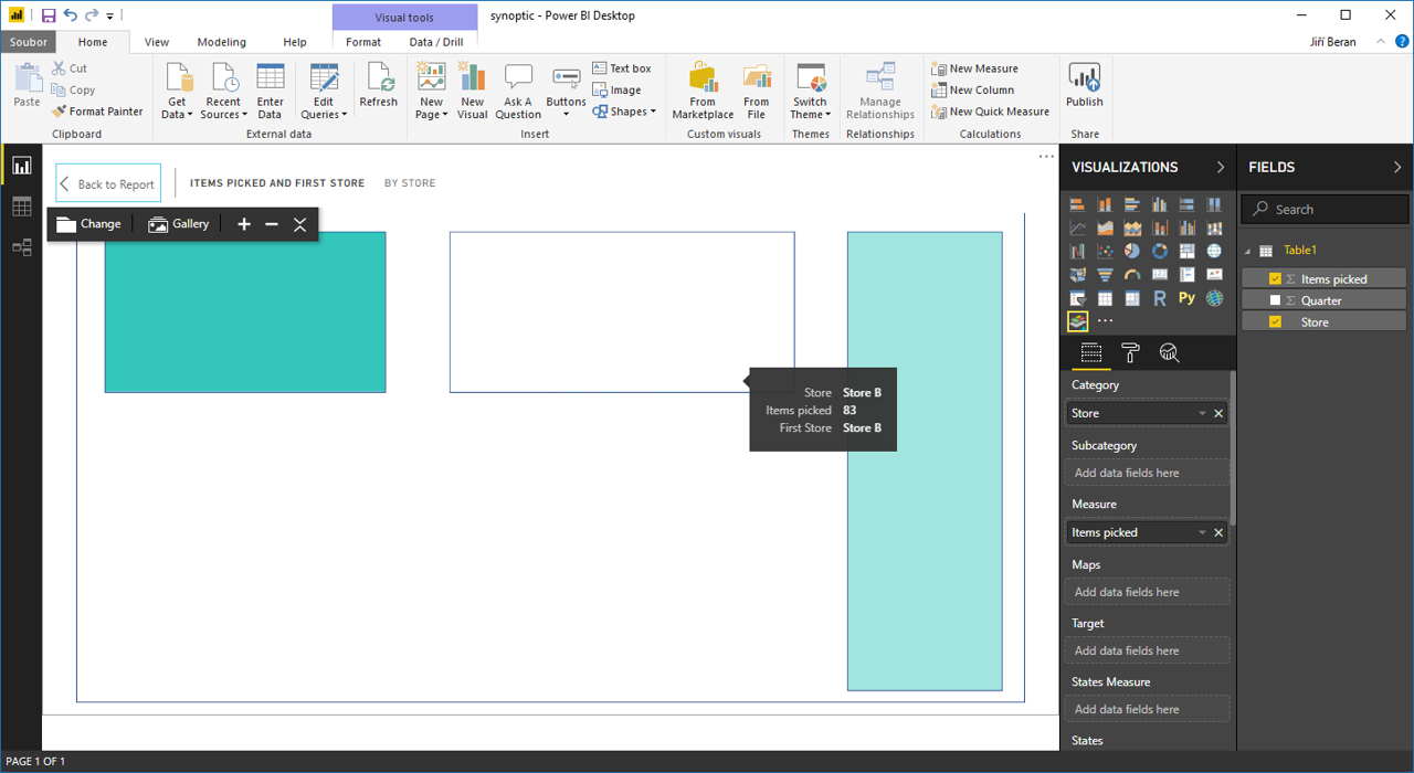
When trying to add something to “Measures”, we are asked to upload the SVG file.
After upload, something has to be added to Category. If the names of areas correspond to values from tables, the areas become green. 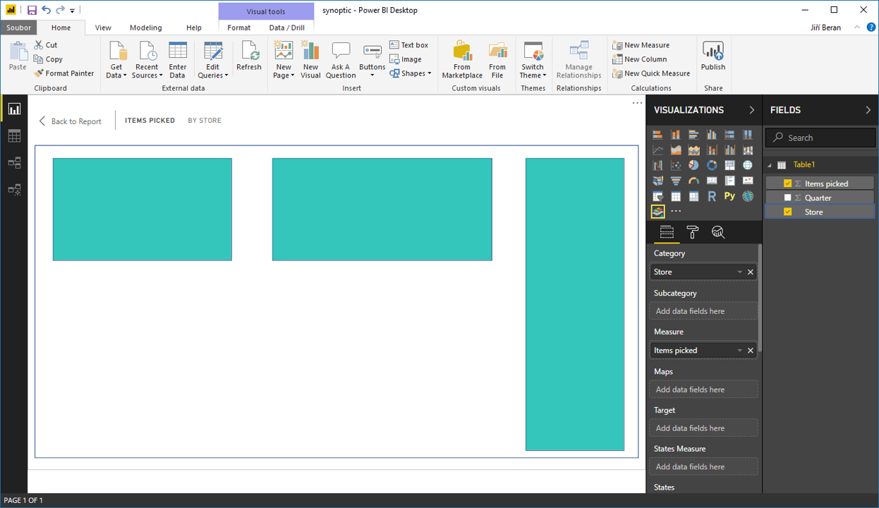
What’s worse, all areas have the same color – regardless the numbers. This has to be defined in “Saturate” in “Format”.
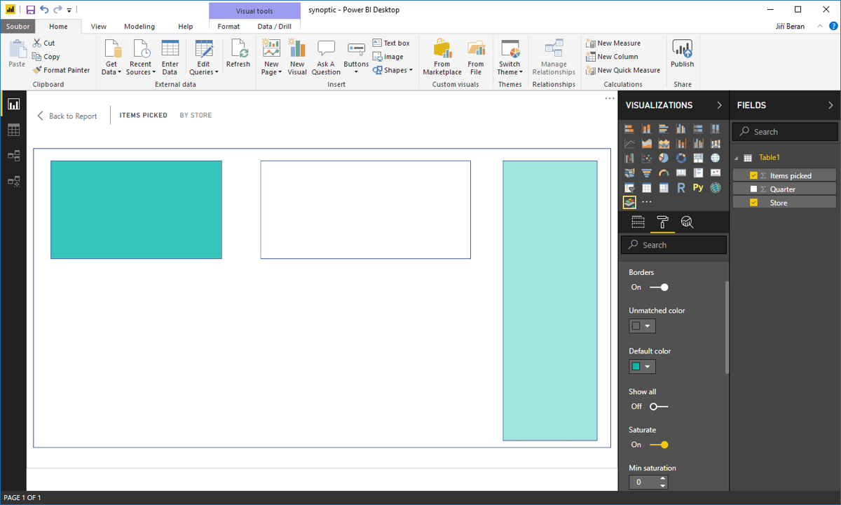
From know we can compare, how the store halls were utilized.
![]()
![]()
Pište kdykoliv. Odpovíme do 24h
![]()
© exceltown.com / 2006 - 2023 Vyrobilo studio bARTvisions s.r.o.