Našimi kurzy prošlo více než 10 000+ účastníků
2 392 ověřených referencí účastníků našich kurzů. Přesvědčte se sami
Author: Lenka Fiřtová
This article describes how to visualize computed correlation matrices in a clear, easily presentable way.
In this article, you can read how to compute correlation in R.
In this article we are going to use the corrplot package, which allows us to create nice and understandable visualizations of correlation matrices. We can install the package using the install.packages command (the name of the package needs to be wrapped in quotation marks). Then we can load the package using the library command (we need to use the library command every time we start R if we are using any packages, but the installation needs to be done only once).
> install.packages("corrplot")

> library(corrplot)
We are going to work with the mtcars dataset, which contains information on 10 aspects of 32 cars. We can access the description of the data using the following command:
> ?mtcars
Let us take a look at the first few rows:
head(mtcars)
                   mpg cyl disp  hp drat    wt  qsec vs am gear carb
Mazda RX4         21.0   6  160 110 3.90 2.620 16.46  0  1    4    4
Mazda RX4 Wag     21.0   6  160 110 3.90 2.875 17.02  0  1    4    4
Datsun 710        22.8   4  108  93 3.85 2.320 18.61  1  1    4    1
Hornet 4 Drive    21.4   6  258 110 3.08 3.215 19.44  1  0    3    1
Hornet Sportabout 18.7   8  360 175 3.15 3.440 17.02  0  0    3    2
Valiant           18.1   6  225 105 2.76 3.460 20.22  1  0    3    1
The corrplot package requires a computed correlation matrix. Let’s first compute the correlation matrix of the variables in the mtcars dataset. Let’s name this correlation matrix k.
> k = cor(mtcars)
To visualize the correlation matrix, we use the corrplot function. There is only one necessary argument, the correlation matrix, and then many optional arguments. We are going to explain the method argument and the type argument.
The method argument serves to determine what the plot should look like. There are the following options: “circle” (default option),”square”, “ellipse”, “number”, “pie”, “shade”, “color”.
For example, the color method returns a plot with the negative correlations marked in red, positive correlations in blue, and the stronger the correlation, the more intense the colour.
> corrplot(k, method = "color")
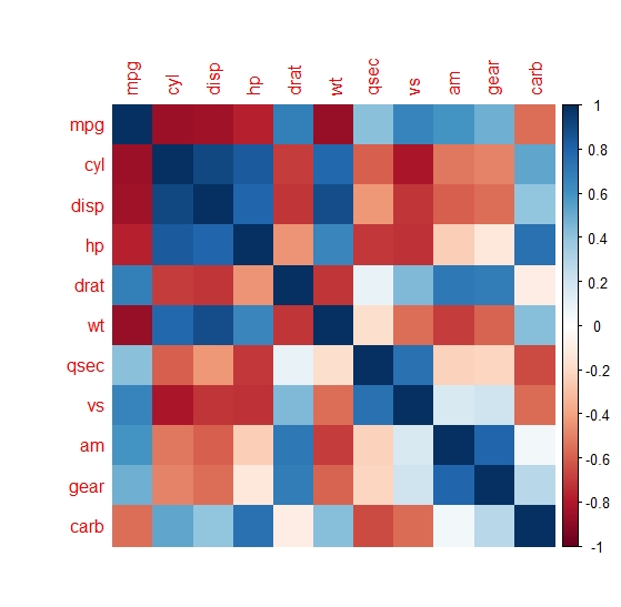
From the plot we can easily estimate that the correlation between mpg and hp is around –0.7, the correlation between mpg and drat is around 0.7. The exact values of the correlations cannot be determined though – the plot serves more as an outline of which variables correlate more strongly and which ones more weakly.
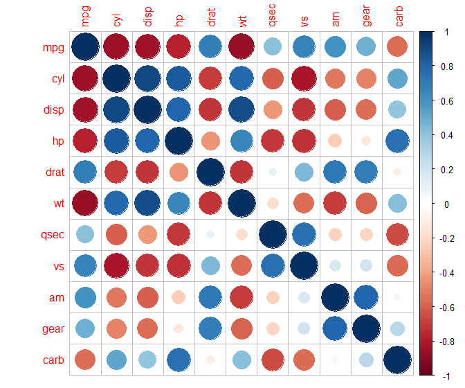
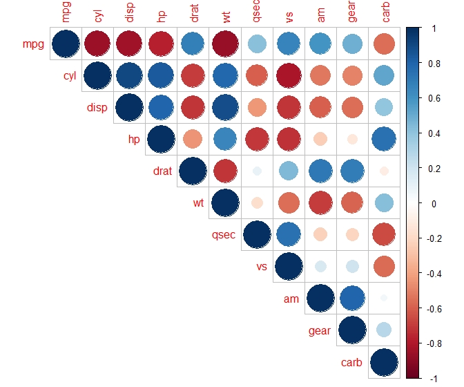
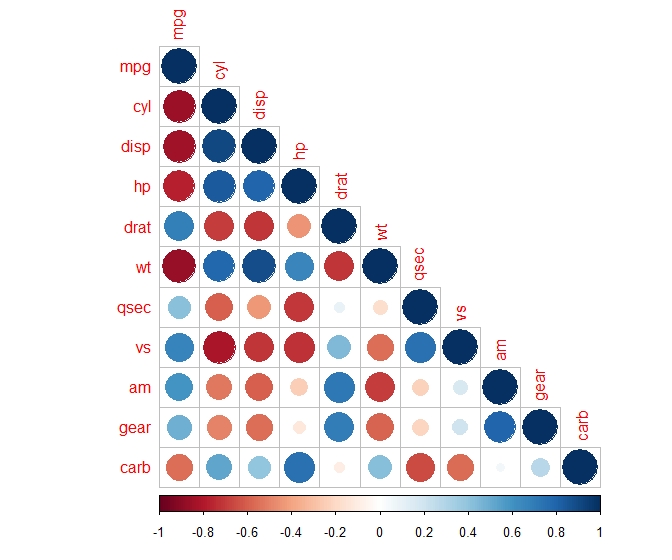
The circle method can help estimate the correlations more precisely: it produces a plot which, apart from colour, displays the strength of the correlations using the size of circles.
> corrplot(k, method = "circle")
The pie method produces a plot where the strength of the correlation is (apart from colour) displayed as the portion of a circle which is in colour.
> corrplot(k, method = "pie")
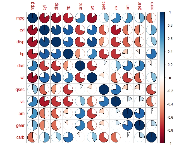
For example, if we take a look at the correlation between mpg and hp (first line and fourth column), we can see that more than three quarters of the circle are in colour, so the correlation must be stronger than –0.75. On contrary, if we take a look at the correlation between mpg and drat (first row, fifth column), we can see that less than three quarters of the circle are in colour, so the correlation must be weaker than 0.75.
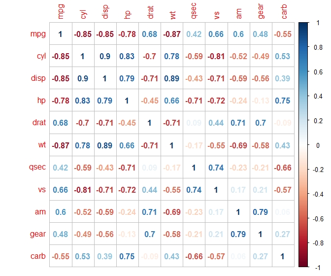
Out of the disponible methods, we get the most precise values using the number method, which displays the actual correlation coefficients. It will show us that the correlation between mpg and hp is –0.78, and between mpg and drat it is 0.68.
> corrplot(k, method = "number")
Each correlation matrix is symmetrical: it has the same numbers above and below diagonal (on the respective positions). It is thus possible to only display the numbers above diagonal, or only the ones below diagonal, without any loss of information.
To do this, we can use the type argument. Let us show how it works using the circle correlation matrix.
> corrplot(k, method = "circle", type = "upper")
> corrplot(k, method = "circle", type = "lower")
![]()
![]()
Pište kdykoliv. Odpovíme do 24h
![]()
© exceltown.com / 2006 - 2023 Vyrobilo studio bARTvisions s.r.o.