Našimi kurzy prošlo více než 10 000+ účastníků
2 392 ověřených referencí účastníků našich kurzů. Přesvědčte se sami
The usefulness of Gantt chart in Power BI is obvious. It can be used not only for project progress, but for any activity in time as well.
How to do it in Power BI?
Just add a custom visual, simply called “Gantt”.
Then add the items. For example from this table:
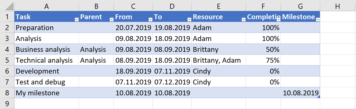
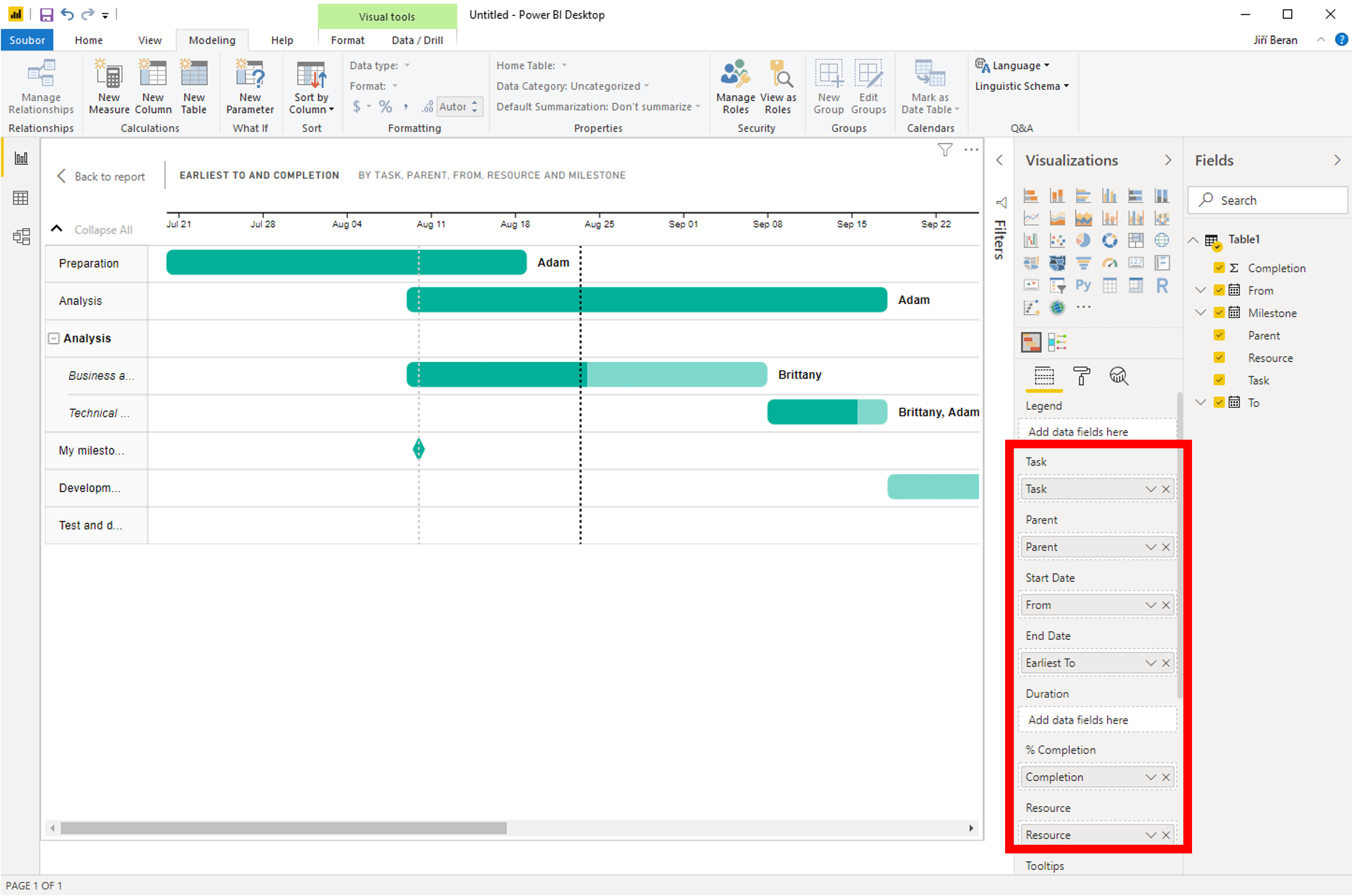
you can place the items like here and see the result:
![]()
![]()
Pište kdykoliv. Odpovíme do 24h
![]()
© exceltown.com / 2006 - 2023 Vyrobilo studio bARTvisions s.r.o.