Našimi kurzy prošlo více než 10 000+ účastníků
2 392 ověřených referencí účastníků našich kurzů. Přesvědčte se sami
This is about the KPI visual in Power BI.
The KPI visual is really useful when you need to compare one value with some benchmark (or, most typically, with previous period).
This example shows how to compare some period with last year. Let´s use this dataset, with dates and orders:
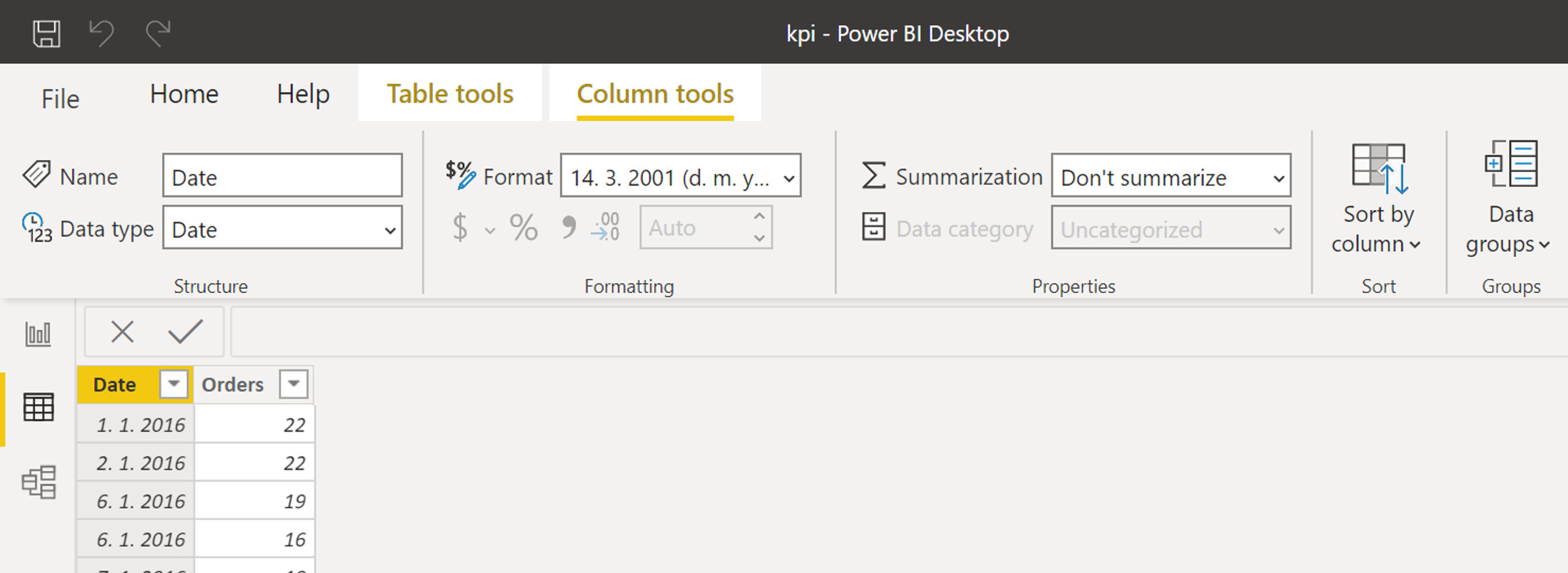
We are going to compare number of orders this period with the situation one year ago.
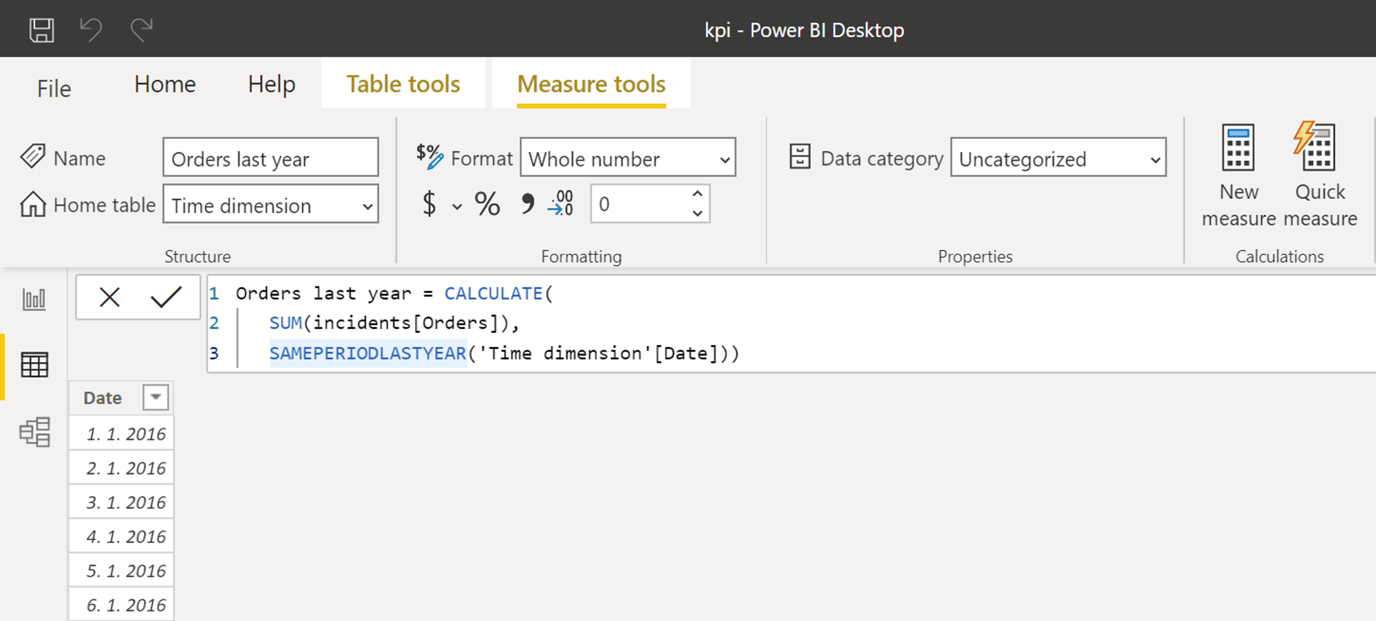
First of all, we need a measure showing the last year value. It´s a piece of cake with SAMEPERIODLASTYEAR:
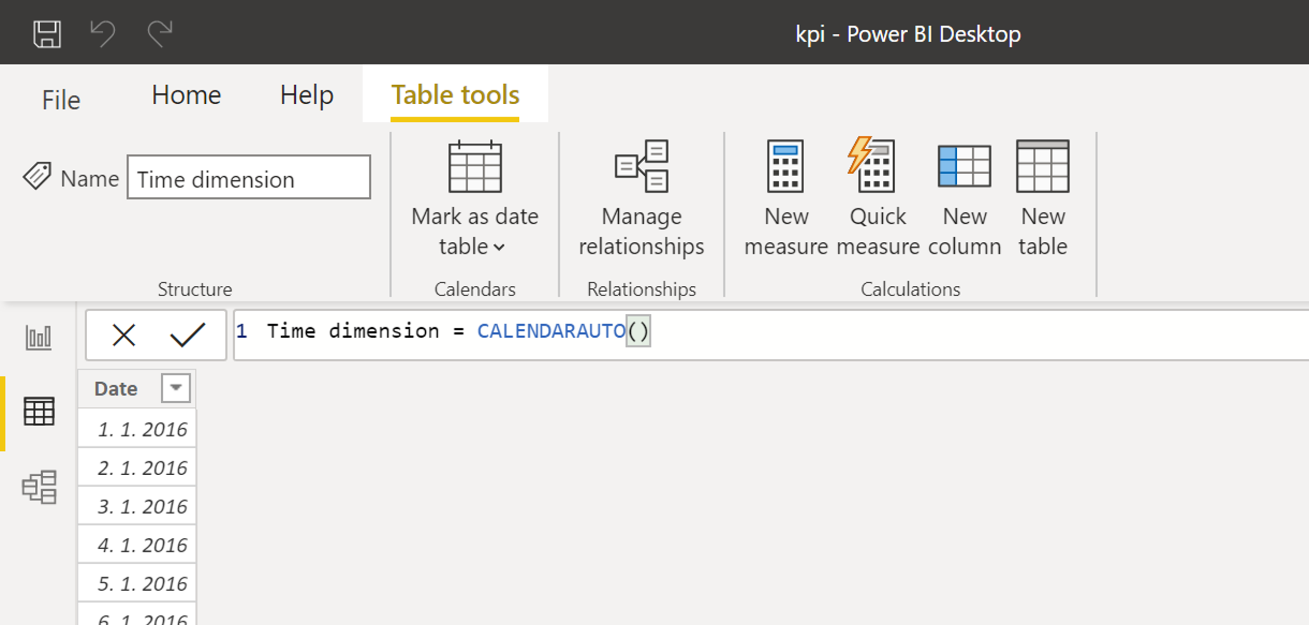
Now create the time dimension (not necessary, but really recommended):
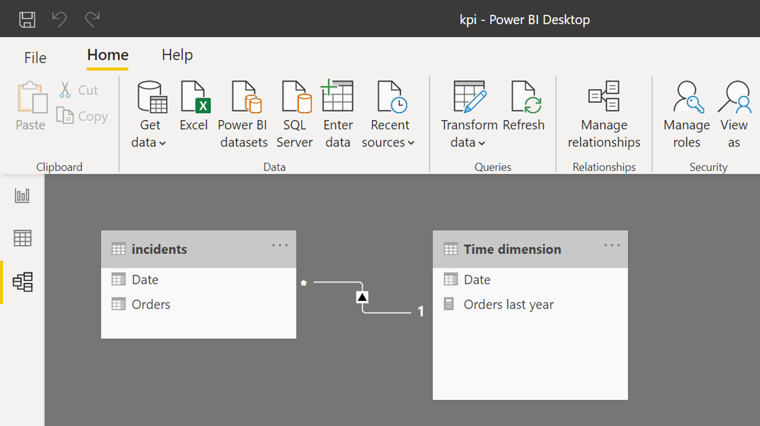
Connect it with the original table:
Now insert the KPI visualization.
Obviously, the “Indicator” contains the value ve are going to control and “Target goals” contains the previous year value.
The “Trend axis” should contain the date from time dimension.
Now the visual shows current value, the last year value, and % of change.
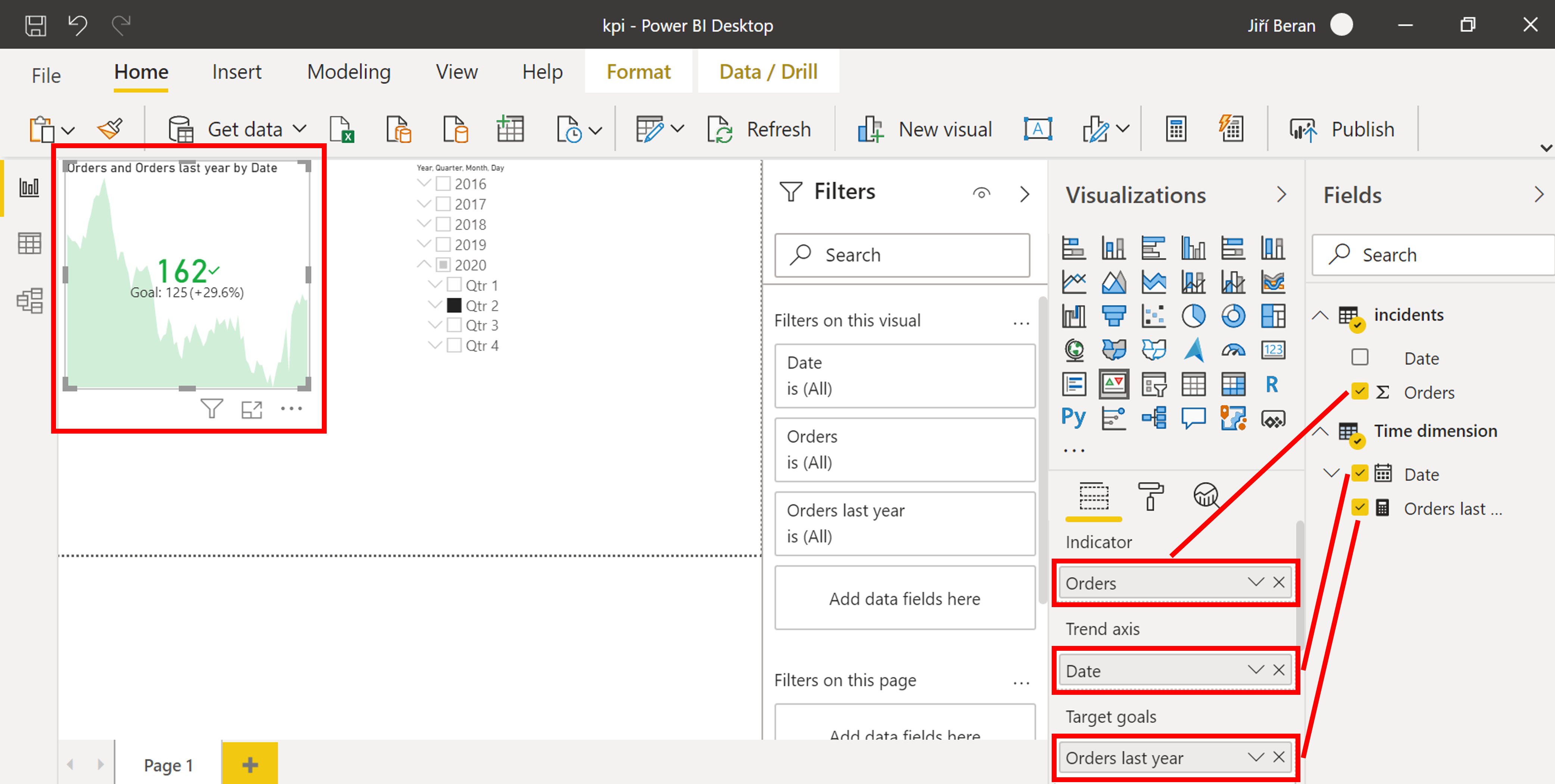
Attention: To keep these numbers meaningful, there has to be some calendar slicer (or similar filter). This slicer filters by the date from time dimension.

![]()
![]()
Pište kdykoliv. Odpovíme do 24h
![]()
© exceltown.com / 2006 - 2023 Vyrobilo studio bARTvisions s.r.o.