Našimi kurzy prošlo více než 10 000+ účastníků
2 392 ověřených referencí účastníků našich kurzů. Přesvědčte se sami
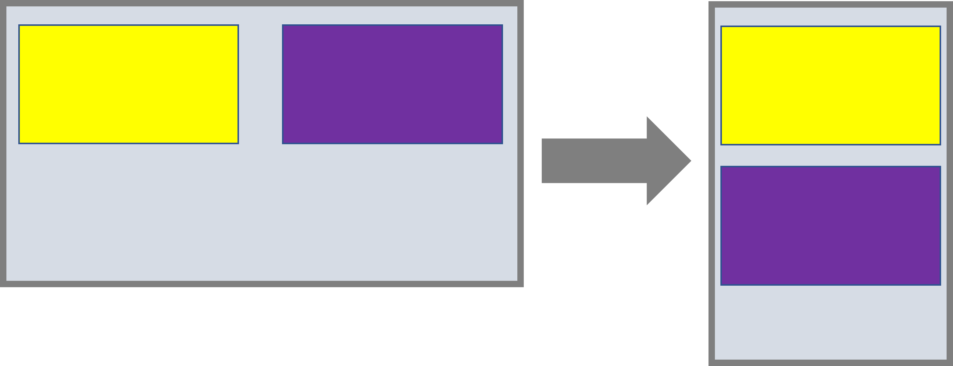
The responsiveness of the application means that the layout of the elements adapts to the width of the display on which we see the application.
Typically, elements that are next to each other by default will move below each other on the narrower display.
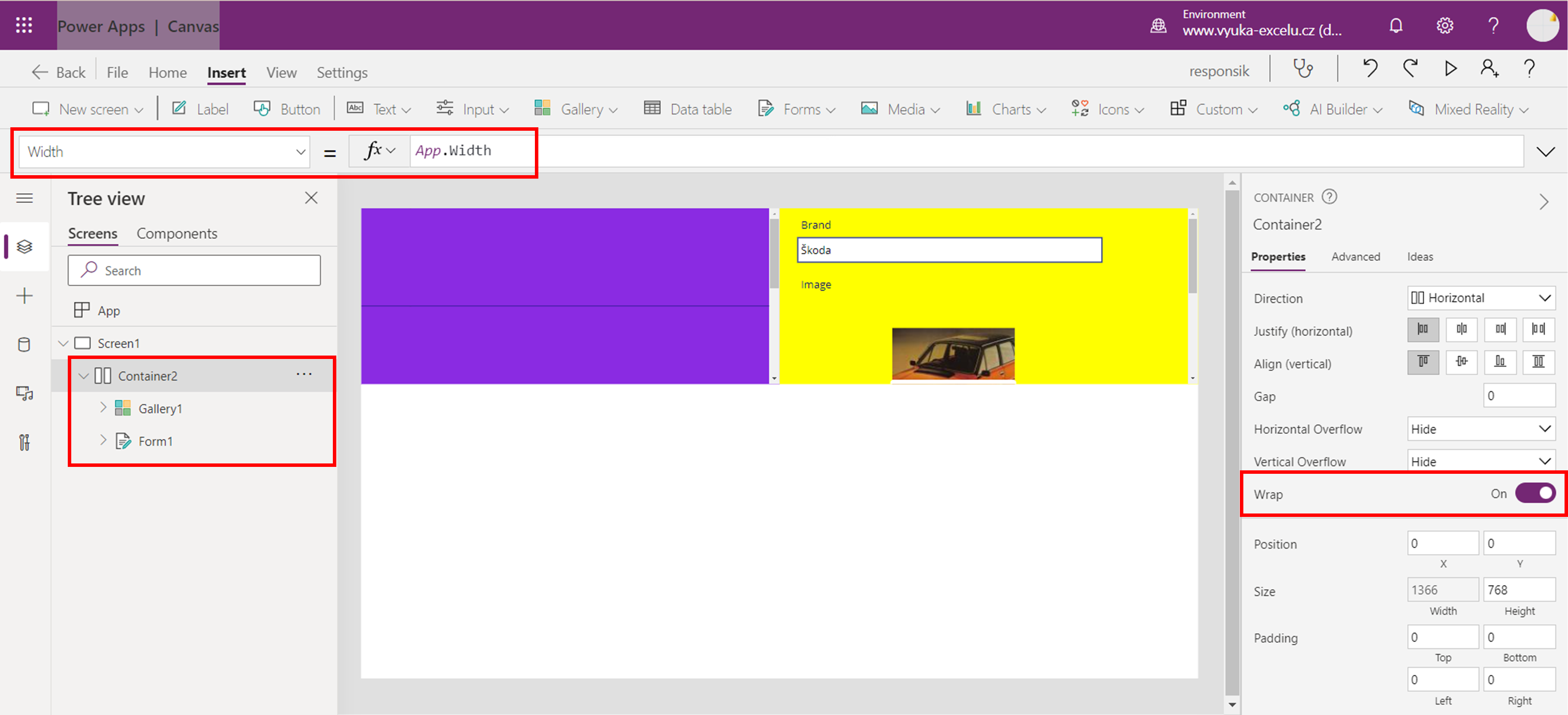
This is an application that contains a form and a gallery.
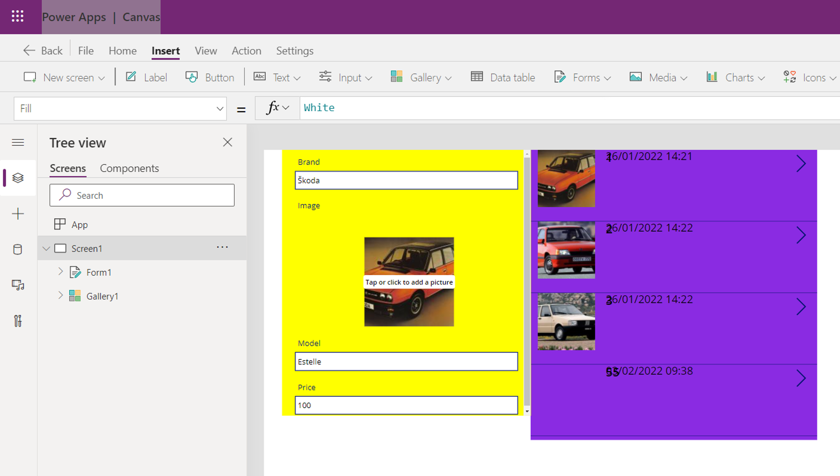
They are next to each other, but we want to set them so that they line up on a narrow display.
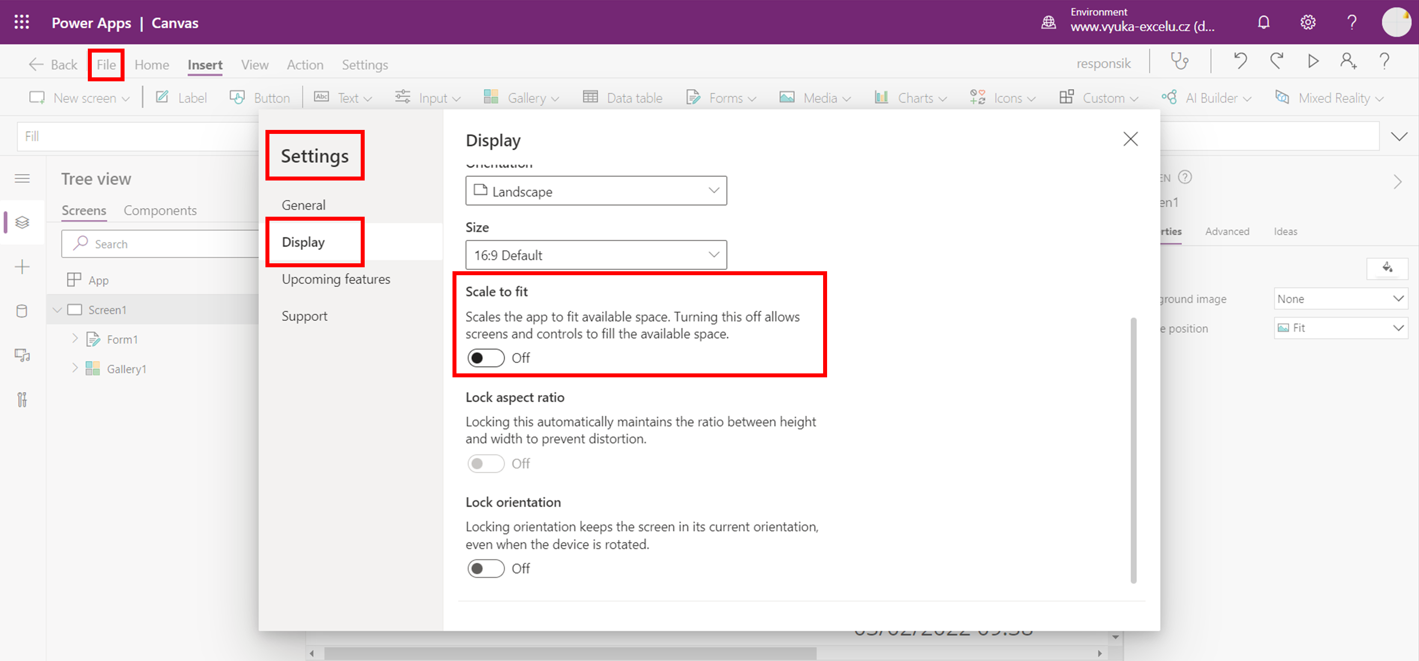
For this to work, we need to adjust the width adaptability of the entire application, put the elements in the container and set the properties of container.
In Settings switch the Display option to “Scale to fit”.
Insert the “horizontal container” (Input – Horizontal container) a move the gallery and form into it.
(This may cause some troubles with ther layout, but lets tune it later)
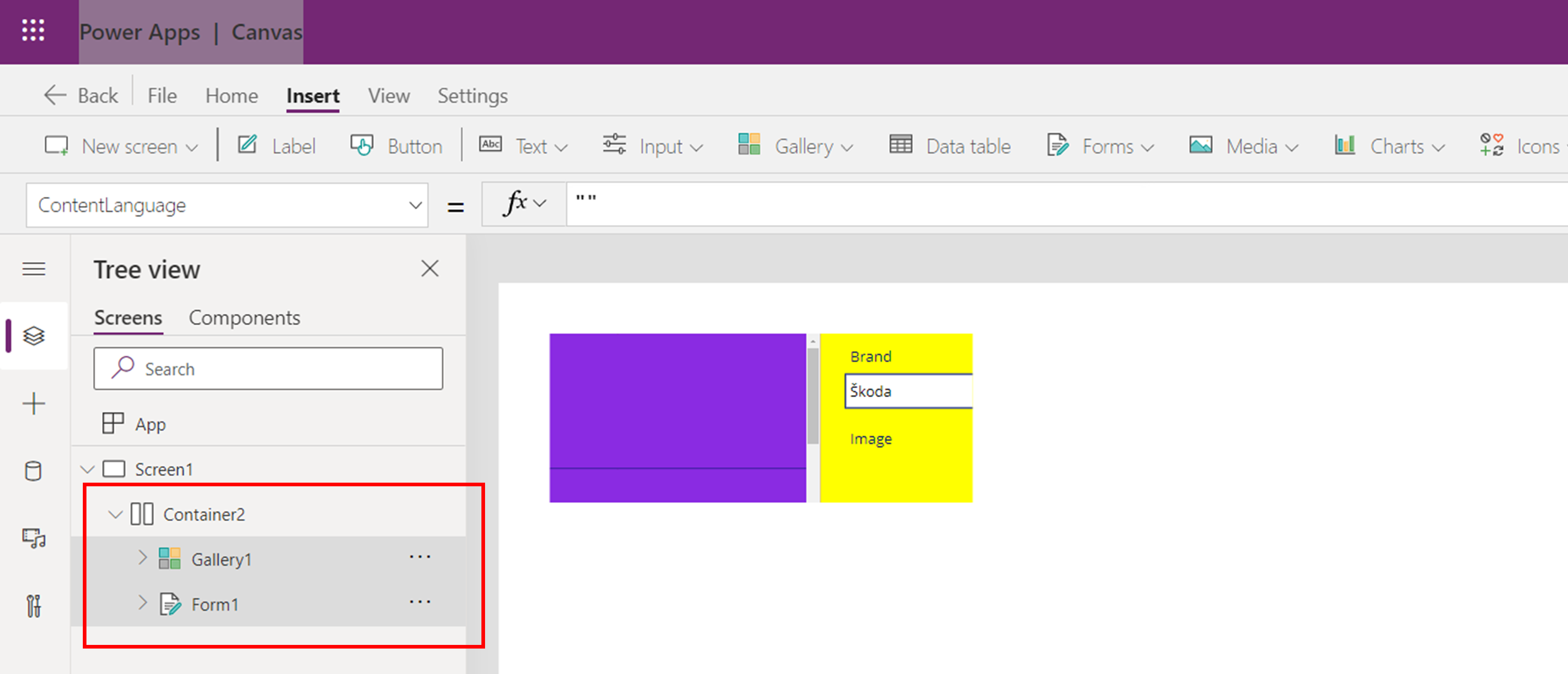
Set the containers width to follow the app width (and possibly make it higher to accomodate everything…) and enable wrapping.
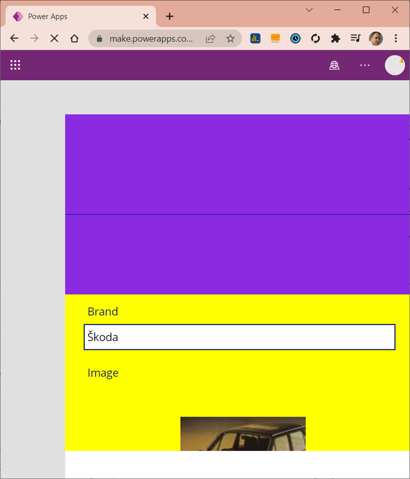
If you run it now in a narrower window, form and gallery (and whatever else…) are aligned below each other.
This article describes only the basic principle. It is clear that additional tuning will be needed – like alignment in the container (vertical and horizontal) or setting gaps between elements etc.
Pište kdykoliv. Odpovíme do 24h
© exceltown.com / 2006 - 2023 Vyrobilo studio bARTvisions s.r.o.